WPSFIXER
By Yago Mateos Lerma · Web design · 28 December 2020 · updated 7 November 2026 · 4 min read
10 tools to ensure an effective web design

In this article
An effective web design isn't just a pretty website: it's a website that's easy to read, loads fast, works for everyone and leads visitors to ask for a quote or buy. These are the tools that help you get there, almost all of them free.
Updated in 2026. We've refreshed the list. Button Generator and Page Ruler are out, as they've become outdated, and MockFlow makes way for Figma, today's standard for designing websites. In come a contrast checker, the browser's own developer tools and PageSpeed Insights, Google's speed test.
1. Google Fonts
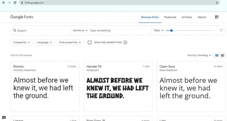
Typography decides whether a text is a pleasure or a struggle to read. Google Fonts brings together more than a thousand free font families, readable on screen and licensed for use on any website.
An important tip: instead of loading the fonts from Google's servers, host them on your own website. It loads faster and avoids privacy issues: in 2022 a German court ruled that loading them from Google without consent sent the visitor's IP address to Google, and therefore breached the GDPR. Most modern platforms and frameworks already let you do this with a single click.
2. WhatFont
Have you seen a font you love on another website? WhatFont is a browser extension that tells you its name just by hovering over the text, along with its size, weight and colour.
It's very handy for finding inspiration or learning which font pairing a website you like uses.
3. Adobe Color
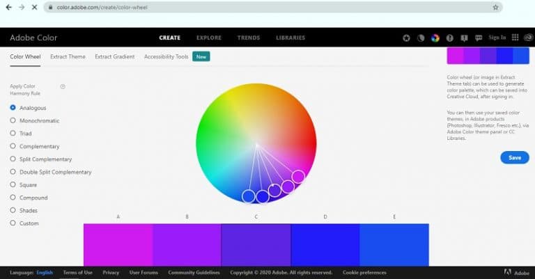
Choosing a colour palette that works isn't easy without design training. Adobe Color suggests combinations based on a colour (analogous, complementary, triads…) and gives you the exact codes to use on your website.
It can also build a palette from a photo, which is ideal for making the website match your brand's images. And it warns you if two colours in the palette are hard to tell apart for people with colour blindness.
4. ColorZilla
ColorZilla is a Chrome and Firefox extension with an eyedropper: click anywhere on a website and it gives you the exact code for that colour. It's the colour version of WhatFont.
If you'd rather not install anything, Chrome's developer tools also have an eyedropper in the colour picker.
5. Figma
Before building a website, it pays to design it. Figma is the tool almost the entire industry uses today for everything from quick sketches to full designs and clickable prototypes.
It runs in the browser, it's free to get started, and you can share the design with a link so the client can comment directly on it. It's the quickest way to make sure everyone is clear about what the website will look like before investing in building it.
6. WebAIM Contrast Checker
Light grey text on a white background can look elegant, but many people struggle to read it, especially on a phone in bright sunlight. WebAIM's contrast checker tells you whether two colours have enough contrast according to the accessibility guidelines (WCAG).
Since 2025, European accessibility rules require many online stores and digital services to be accessible, so checking contrast is no longer just good practice.
7. Canva
Canva lets you create images for your website and social media without knowing design: blog headers, banners, images for sharing on social media or presentations. It has thousands of templates, icons and photos.
Use it to give your images a style of their own. Generic stock photos, which appear on hundreds of websites, don't inspire much trust.
8. Browser developer tools
Chrome, Firefox, Edge and Safari come with developer tools that you open with the F12 key. They're very useful for design:
- Device mode shows you how your website looks on different phones and tablets without having them.
- You can measure any element and find out the size each image is displayed at, so you don't upload it bigger than it needs to be.
- You can change text and colours live to try out ideas before touching the real website.
9. TinyPNG and Squoosh
Images are usually the heaviest thing on a website. TinyPNG compresses JPG, PNG and WebP photos with no noticeable loss of quality: just drag them onto its website.
Squoosh, from Google, goes a step further: it lets you compare the original image with the compressed one and convert it to WebP or AVIF, modern formats that weigh much less than JPG. Many platforms already do this conversion automatically.
10. PageSpeed Insights and GTmetrix
A beautiful but slow website loses visits and Google rankings. PageSpeed Insights, from Google, analyzes any page and tells you how it scores on Core Web Vitals, with real user data where available, and what's holding the loading back.
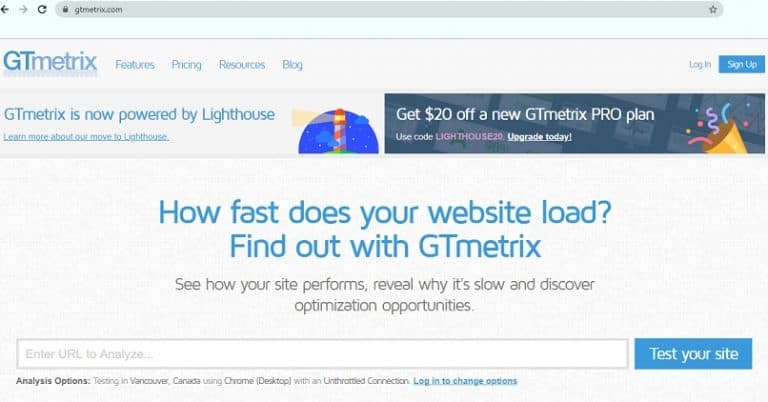
GTmetrix offers a similar analysis, with a very clear chart of the order in which each element loads, ideal for finding the file that slows everything down. If you want to know what the metrics mean, we explain them in our article on Core Web Vitals.