WPSFIXER
By Yago Mateos Lerma · Ecommerce · 11 February 2021 · updated 7 November 2026 · 4 min read
8 tips for an attractive online store design
In this article
- 1. Design for mobile first
- 2. Keep the search bar and cart visible
- 3. Make navigation easy
- 4. Let people filter their searches
- 5. Publish high-quality images
- 6. Make it clear when an item is unavailable
- 7. Don't leave shipping costs until the end
- 8. Make checkout fast
- And also: accessible and easy to find
- More tips for your ecommerce
Online store design is much more than a pretty presentation: it's what decides whether a visitor finds what they're looking for, trusts you and completes the purchase. These are the tips we apply when we design stores for our clients.
Updated in 2026. We've reviewed the tips and added what has changed most: today most purchases start on a phone, customers expect to pay with their phone or with local methods such as Bizum in Spain and, since June 2025, many online stores are required to be accessible.
1. Design for mobile first
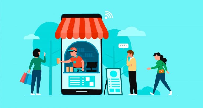
In most stores, more than half of visits come from a phone. If your store is designed for desktop and "also works" on mobile, you're losing sales.
- Large buttons that are easy to tap with your thumb.
- The add-to-cart button always in view on the product page.
- Text you can read without zooming.
- And fast loading, even on a so-so data connection.
2. Keep the search bar and cart visible
People who use the search box usually know what they want, and that's why they buy more than average. Put it at the top and in plain sight, not hidden behind a tiny icon, and make it suggest products as you type and cope with spelling mistakes.
The cart must also always be accessible, showing how many products it holds. When someone adds a product, confirm it clearly without taking them away from the page they were on.
3. Make navigation easy
Visitors appreciate finding what they want in a few clicks. To make that happen:
- A clear menu, with categories that use your customers' words, not your warehouse's.
- Breadcrumbs (Home > Women > Trainers) so people can easily go back if they enter a category by mistake.
- Your most important categories and products, reachable from the home page.
4. Let people filter their searches
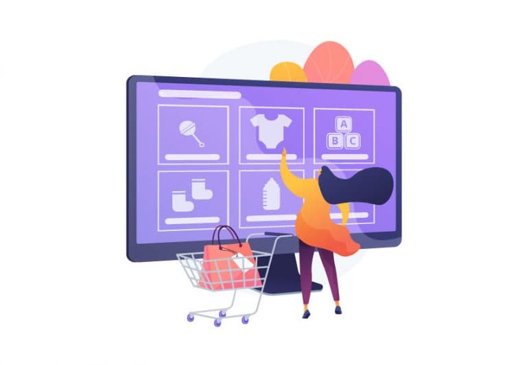
If you sell products in different sizes, colours or prices, filters are essential: they save time and avoid the frustration of falling for a product that isn't available in your size.
On mobile, group the filters in a panel that's easy to open and close, and show how many results remain with each option so nobody ends up on an empty page.
5. Publish high-quality images
In an online store, people buy with their eyes. Show several photos of each product, from different angles, with zoom and, where it makes sense, in use (worn, in a home, next to another object to show its size). A short video helps a lot for products that are hard to picture.
High quality doesn't mean heavy: optimize them so the product page loads fast.
6. Make it clear when an item is unavailable
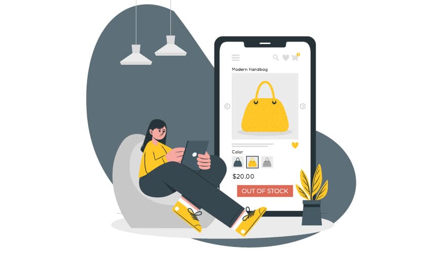
Few things are more annoying than finding out at the last step that a product is out of stock. Show availability on the product page itself and, if it's out of stock, offer an email alert for when it's back.
Don't delete the out-of-stock product page: for rankings, it's much better to keep it live. We explain why in our ecommerce SEO guide.
7. Don't leave shipping costs until the end
Finding unexpected shipping costs at the last step is one of the main reasons people abandon their carts. Show them from the start: on the product page, in the cart and, if you offer free shipping above a certain amount, remind people how much more they need to spend to get it.
8. Make checkout fast
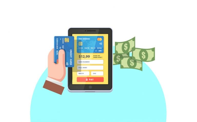
Checkout is where most sales are lost. So that nobody gives up halfway:
- Allow guest checkout. Forcing people to create an account makes many of them leave.
- Offer the payment methods your customers use: card, Apple Pay and Google Pay, PayPal, local options such as Bizum in Spain and, if your average order is high, buy now, pay later.
- Ask only for the essential details and let the browser fill them in automatically.
- Remove distractions: checkout doesn't need the full menu or banners.
And also: accessible and easy to find
Two things you don't see at first glance, but that are also part of good design:
- Accessibility. Since 28 June 2025, the European Accessibility Act requires most online stores in the EU to be usable with a screen reader, with a keyboard alone and with good contrast. Only microenterprises (fewer than 10 employees and under €2 million turnover) are exempt. Even if it doesn't apply to you, an accessible store sells to more people.
- SEO. A well-designed store also has to be easy for Google to understand: its own titles and descriptions, product pages with original text and a fast website. While SEO kicks in, you can bring in visits with Google Ads campaigns and by appearing for free on Google Shopping.
More tips for your ecommerce
- Customer reviews and ratings on product pages: they give shoppers confidence and give Google unique content.
- Clear information on returns, delivery times and contact, one click away from any page.
- A quick channel for questions, such as live chat or WhatsApp.
- Give the store personality with your own photos, copy and tone, so it doesn't look like just another one.
- If you have a newsletter, offer something in return for signing up, such as a discount on the first order.